
MK Socials
Design a responsive website for a digital marketing agency.

Background
I teamed up with MK Socials, a digital marketing startup agency, to design a website that felt as inviting as their mission. MK Socials specializes in enhancing a business's social media presence and driving customer conversions. In a competitive industry, our goal was clear: goal was to stand out and forge genuine connections with potential partners.
Role
-
End-to-end UX Designer
-
UX Researcher
-
UI Designer
-
Branding
Project Type
-
Client Project
-
Responsive Website
Timeline
4 weeks
(80 hours)
July - Aug 2023
Tools
-
Figma
-
Figjam
-
Mural
-
Notion
Problem
Client lacks precise vision for the website’s design and content.
The client contacts potential customers to offer marketing services but lacks a dedicated website for reference. Her goal is to create a website that showcases her services for effective partnership proposals. She also faces budget constraints, opting to leverage Squarespace for website development.

Solution
A modern and sleek website design that aligns with her personal brand.
I designed a minimalistic website, highlighting my client's services and success stories with user-friendly navigation, all within the budget and tech limits of Squarespace. It's a gateway for potential partners to connect effortlessly.
Understand the company
It all began with a one-on-one interview with the client herself, to better understand her brand, mission, and voice in the world of social media marketing.
"I've always had a passion for content creation, and I found my calling in marketing, helping businesses enhance their social media presence and fuel their growth."
- Client
Her aspiration? To craft captivating brand stories and leverage the power of social media to create meaningful connections between her clients and their target audience for their businesses.
Understand customers
I conducted interviews with potential clients seeking marketing assistance for their small businesses. My goal was to gain insights into their marketing needs, preferences in a potential marketing partner, and any prior experiences with marketing companies.
Key Findings:
Clients prioritize an intuitive way to access information about services offered, pricing details, and conversion rates.
Clients want transparency in reporting and communication, with a clear understanding of how marketing efforts are performing and how the budget is being utilized.
Clients want evidence of past successful campaigns and a track record of delivering tangible results, such as increased website traffic, leads, or sales.
What are the competitors doing?
Some marketing websites lacked clarity, while others overwhelmed visitors with excessive information.
Together with my client, we conducted a competitive analysis of digital marketing companies' and freelancers' websites. This provided us with valuable market insights, allowing us to tailor the content strategy for my client's website.

Key Takeaways
Design Opportunity
The competitive research offered valuable insights into what should be incorporated into my client's marketing website and how to distinguish her in the market.

Who are the users?
I’m designing a website for my client’s potential clients
Based on MK Socials’ past and current clients, I’ve defined two personas. Meet Michelle and Sara! They are both business owners within the food and hospitality industry and both potential clients for MK Socials. However, they have different needs, desires and pain points related to digital marketing.


Time to ideate!
Site Map to organize
With the project goals in mind, I developed a very simple site structure that prioritizes the business and user needs. My primary focus was to establish a solid foundation for MK Socials, with the flexibility to expand and refine in the future.


Task Flow
Imagining how people interact with the website
Developing task flows based on my user personas allowed me to delve deeper into the specific journeys that users like Sara and Michelle would undertake when interacting with the website.

Time to Design!
Important to mention that certain design choices had to align with the direction approved by the client.
MK Socials needed key pages that strike a balance between providing sufficient information for users without overwhelming them.
The client intends to incorporate pricing information at a later stage, so my primary focus was on crafting the Home Page, Services Page, Portfolio Page, About Page, and Contact Form Page.
During this process, I offered suggestions for copywriting and imagery, collaborating closely with the client.
Initial Concept
Wireframes in desktop and tablet


Visual Design
Creating brand guidelines
Without a pre-existing brand guideline, I partnered with the client to establish a design that aligns with the brand's principles. To facilitate website construction on Squarespace, I crafted a style guide encompassing all design elements for easy hand-off.
Our choice of a primary color was green, symbolizing security and success, while the inclusion of warm neutrals infused warmth and inviting aesthetics.

Final Concept
Refining content and applying visual design


Usability Testing
Minimal delay or confusion to finish tasks
I recruited 5 participants to give feedback on the design and uncover any opportunity for improvement while asking them to complete tasks based on task flow.
The Goals:
Assess the website's usability to determine the ease of user navigation.
Identify potential challenges or pain points experienced by users while completing tasks.
Gather user perspectives on the overall design, including its attractiveness and informativeness.
What happened?
100% task completion rate with minimal delays or confusion among participants. They also expressed a favorable opinion towards the overall design and its smooth flow.

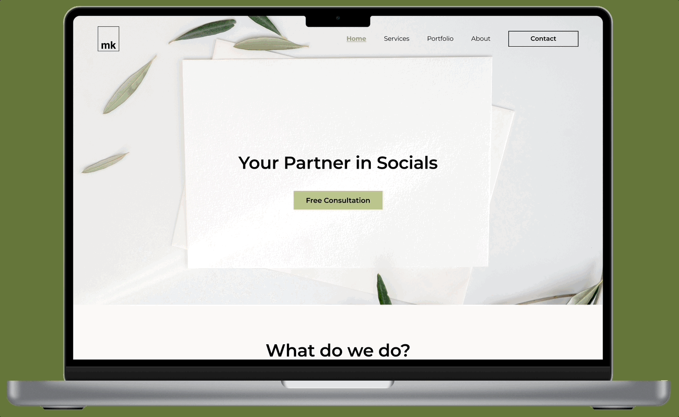
However, the first two participants voiced some confusion regarding the CTA (Call to Action) button, as they found the term "Explore" somewhat vague in describing its destination.


I changed the CTA to "Free Consultation," aiming for clarity. This adjustment not only defines the button's purpose but also conveys cost-free agency consultations succinctly.


Reflection
Learnings
-
Clarifying the Call-to-Action, can drastically alter user interactions. These adjustments not only boosted user retention but also encouraged further engagement, given the offer of a free consultation, making a positive business impact.
-
Frequently consult with stakeholders regarding their envisioned direction, offering insightful recommendations, considering that some stakeholders might not possess a deep understanding of UX design.
Challenges
-
Navigating design within budgetary and technical confines.
-
Presenting and justifying design decisions to the client, including the rationale behind content prioritization on the website.
Next steps...
For this project, I focused on the home page, service page, about page, portfolio page and contact page that is ready to be built and launched officially. The next steps are:
-
Design the mobile version of the responsive website and conduct usability testing.
-
Add transparent pricing information on the website to enhance business integrity and foster client trust.
-
Assist the client in constructing the website using Squarespace.